Read time: 3 minutes 45 seconds

2 weeks since the last newsletter - feels more like 2 months.
Can’t wait to share what we’ve been cooking up. Soon.
Since writing has taken a backseat to prioritise crafting, today’s edition is unironically dedicated to the craft of writing.
Enjoy.
— Tom
P.S. Thanks for giving some love to today’s sponsors, who keep these breakdowns free.
Since this newsletter has grown, we’ve been lucky enough to make a non-negotiable commitment to only work with brands who (1) offer extremely high quality products, and (2) are extremely relevant to the typical Strategy Breakdowns reader.
Design Principle: Exclusively handpicked ads, that value-add.


Supports any GTM motion from self-serve to sales-led
Only takes minutes to set up
Syncs your email and calendar for your relationship insights
Enriches your contacts
Gives you powerful reports
And lets you build Zapier-style automations
Why spend weeks setting up your CRM when you can get it done today?
Loved by fast-growing companies like ElevenLabs, Replicate, Modal and more.
Looking for top talent without blowing your budget?
Athyna helps you build high-performing teams faster—without sacrificing quality or overspending.
Here’s how:
AI-powered matching ensures you find top-tier talent tailored to your exact needs.
Get candidates in just 5 days, ready to onboard and contribute from day one.
Save up to 70% on salaries by hiring vetted LATAM professionals.
Ready to scale your team smarter, faster, and more affordably?
Thank you for supporting our sponsors, who keep this newsletter free.


Chess Move
The what: A TLDR explanation of the strategy
Designed as the digital equivalent of a typewriter, iA Writer, by Information Architects (iA), offers a minimalist writing environment unlike most mainstream word processors.
Font choice, colour, and the ability to add elements like tables are limited. When you open the application, you begin with only an empty screen and a blinking blue cursor, signifying that all you can essentially do with it is write.

iA Founder Oliver Reichenstein alluded to their distraction-free approach to word processing as a "David vs. Goliath" strategy against monolithic global rivals like Microsoft.
Through this, they’ve sold over 3 million copies and pioneered a new category of writing applications by creating an immersive, flexible, and transparent product experience with a deep appreciation of craft as a Northstar.

💡
Strategy Playbook: Focus on the essence of the user activity to forge core features that productively immerse and engage.


Breakdown
The how: The strategic playbook boiled down to 3x key takeaways
1. Immersion Without Distraction
iA Writer's core features immerse users into their writing. The software is designed so your hands never have to leave the keyboard.
Rather than offer a multitude of ways to fiddle with formatting (like many word processors typically do), iA Writer's thoughtful features ease users into a flow state:
A singular font* with three variable options focuses you on the writing
Focus Mode dims sentences and paragraphs you're not working on
Markdown provides a lightweight syntax for consistent formatting and faster writing
* it took 7 years for iA to introduce its first additional, albeit subtly different font option.

An excerpt from iA's thoughtful blog post examining the trade-offs of text formatting
Rather than trying to be an all-in-one tool, iA's stance is that other tools like InDesign are often better for laying out pictures, implying you really shouldn't be doing that in software like Word anyway.
2. Flexible Features to Meet Users' Needs
When writing inspiration strikes, iA Writer's flexibility meets its users where they are. Its mobile application isn't limited—it offers customizable features that can make its experience as robust as the desktop version.
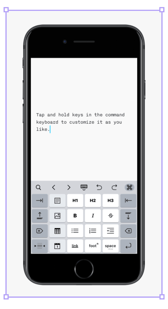
A customisable keyboard on mobile offers quick shortcuts to support your preferred workflow
The Lightning Menu is a customisable menu that quickly pulls up shortcuts with a single tap. A keyboard with customisable buttons can also be configured.
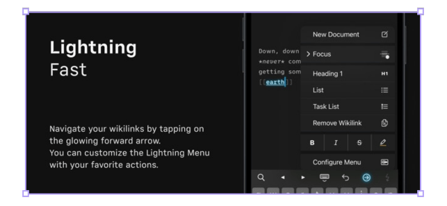
Recent features like Wikilinks (functionally similarly to how links work on Wikipedia) add another dimension of versatility. You can connect your thoughts and learnings, make them easily findable and thus build a living web of articles, notes, research, and ideas."
3. Transparent Philosophy That Builds Trust
iA Writer can't be everything to everyone, nor does it intend to be.
While some may question features like the benefits of Markdown, iA nevertheless thoughtfully details a broad range of considerations they've explored in their blog and social media. From a comparative analysis of Rich Text vs. Plain Text vs. Markdown to interrogating Apple's early UI guidelines for the iPad, their rationale reveals a deep level of intentionality driving their "detail-obsessed quest" and, ultimately, their design choices.
Their transparency can be bold at times, yet informative, whether you agree with their particular stances or not. This, in turn, has been an effective way for them to cultivate trust and appreciation for their unique philosophy if one is inclined to take a closer look.
Instead of an additive approach in an attempt to satiate everyone's needs, the opinionated positions they take and clearly articulate foster a deep resonance in their user community, as one reviewer shared:


Rabbit Hole
The where: 3x high-signal resources to learn more
[11 minute read]
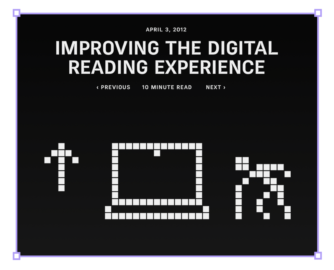
A compelling dive into digital vs. analog reading and what that means to design better software.
"Studying these layers it becomes clear that books are not as linear as they first appear—before opening a book many people look at the back cover, the dust jacket flaps, and the table of contents."
[3 minute read]
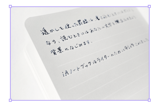
iA's physical notebook is the real-world counterpart to its writing software; designed for focused, clean, distraction-free writing. The notebook’s guidelines are barely noticeable—as you write, they disappear due to contrast.
Swiss paper makers and bookbinders described the task as impossible, so they sought specialists in Japan.
They finally got it right after creating 100 prototypes and 20 test prints.
[42 minute watch]
iA CEO, Oliver Reichenstein shares their similarly bold approach to making presentations. iA Presenter leads its users towards articulating the story they're trying to tell first, rather than distracting them with layout options beforehand.
That’s all for today’s issue, folks!
Thanks again to our wonderful sponsors Attio and Kinde, and to you, the reader, for being here today.
We’ll be back with more in 2 weeks.
— Written by Carver Wilcox, edited by Tom Alder


Whenever you're ready, there are 3 ways we can help you:
Our flagship course on how to use free internet data to make better strategic decisions. Contains 5 years of strategy expertise, proven methods, and actionable tactics to accelerate your career with modern-day strategy skills.
We have a growing audience of 55,000+ strategists from top companies like Google, Meta, Atlassian, Stripe, and Netflix. Apply to feature your business in front of Strategy Breakdowns readers.
One of the most common questions we get asked is: “What tools do you use to run Strategy Breakdowns?” So, we’ve open-sourced our tech stack to give you an inside-look at exactly what tools we’re using to power each corner of this operation.


